Mr. Kathleen Kirkwood here again . . . This post discusses the text and the banners, which we added to all versions of the cover, in some degree.
Let’s talk about the text first. When our son Scott updated the original Trafford cover for his grandfather’s e-book and print book, VENECIA’S EARTHLING (see below), he used new fonts that we really liked (Monotype Corsiva for the title and Opus for the author’s name). His grandfather had commissioned the original artwork, and Scott re-used it as the cover background. But, Scott changed the layout, in particular he placed the title and the author name in new locations and used new royalty-free or purchased fonts, with effects. [FYI, we’re in the process of creating a new cover for the book, using royalty-free photos instead of the painted artwork. We’ll share the results here in a future post.]
So, we started with those fonts in mind. We tried some other fonts on various versions of the cover also, but finally chose Monotype Corsiva for both the author’s name and the title for SHADES OF THE PAST. We also chose the Times New Roman font for the “Award-Winning Author” and the “A Marvelous Author” quote from Julie Beard (we used the full Julie Beard quote on the back cover – we’ll talk about the back cover later in the series). This is how the unenhanced text looked in the final fonts:
Kathleen Kirkwood
Shades of the Past
Award-Winning Author
A Marvelous Writer – Julie Beard
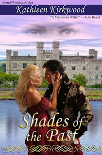
You’ll notice from the cover progression on Anita’s 5/23/2012 post that we added some coloration and effects to the title and author name. Our son had introduced us to these techniques when he created his grandfather’s new cover. We used Drop Shadow and Inner Bevel on the author name. We used Drop Shadow, Outer Glow, Inner Bevel and a brass Gradient Overlay on the title. We chose the gradient color to closely match the gold color on the hero’s coat. Our son, Scott, showed us how to brighten and highlight the color to stand out. This is what the enhanced text looked like:
Next, let’s discuss banners. As a point of interest, Anita always liked the “Lords of Midnight” banner the publisher placed on the cover for the original release of SHADES OF THE PAST (see her 5/23/2012 post). So, a banner was definitely called for. As you’ll notice from that post, we tried various approaches in the various iterations of the cover for setting off the title and author’s name with banners. We created backgrounds for each of the banners with Adobe Photoshop’s rectangle tool. We resized the rectangles as needed using either the Path Selection Tool or the Direct Selection Tool and we used fills to color them. To make the colored rectangles into banners, we used Photoshop’s layering pane to place the rectangles behind the text to create the effect of text on a colored stripe or box (turning the effect into a banner). This is where we refined the text enhancements discussed above. You really can’t tell how the text effects will change the look and feel of the banner until you get the text onto the target background.
Here’s what the final version of the cover looked like with the text and banners in place.
The next post will discuss the addition of the couple to the cover. Check back with us next week. Thanks!


No comments:
Post a Comment