Sunday, August 19, 2012

Desktop Background

I created a "Kathleen Kirkwood Cover Collection" desktop background for my Windows 7 laptop computer and was wondering if you'd be interested in having me put this up for you to download for your computer. Here's what it looks like . . .


The background is a 1600x900 resolution image, but should scale to the size of your 16x9 widescreen display if you choose the "stretch" option. The Windows 7 task bar comes up to the bottom of the title line. If you have Aero enabled, you'll see the copyright line through the transparent task bar.

I'm also considering a photo collection of all of the ByDand Publishing covers to use with the "photo" option of your screen saver. Please let me know if you're interested in having that also.

Please indicate your interest by adding a comment to this post, or by sending us an email at: ByDandPublishing@centurylink.net

Thanks,
Mr. KK.

Friday, August 10, 2012

Building Your Kindle e-book

Hi, Mr. KK here again. This will be my last post on the Kathleen Kirkwood blog site (for now). In the near future, I will copy all of the technical blogs over to a new blog site, that of ByDand Publishing. Any future posts of a technical nature will be published there. We will also create a place on Anita’s website that will archive these blogs for easy reference. Her website URL is: http://www.kathleenkirkwoodhistoricals.com/. Next week, Anita will return with her “Author Confidential” peek behind the scenes of creating SHADES OF THE PAST and A SLIP IN TIME.

This post is about creating your Kindle e-book. I’m embedding Kindle Direct Publishing’s (KDP) Simplified Formatting Guide, which goes through the process you need to follow to create and publish your Kindle e-book. I would have preferred to embed a link to the document, located on their website, since it was created by KDP. But, because it’s a little tricky to find it, download it and get it into a print-compatible version, I’m embedding it instead.

Please note that, in the “Uploading” section, we use the MobiPocket Creator to create a PRC file locally and then upload it to KDP, instead of uploading a Microsoft Word document. We like the fact that we have total control over the formatting and conversion to Kindle format right on our own computers rather than relying on KDP’s conversion programs. Here is KDP’S Simplified Formatting Guide:

--------------------

Simplified Formatting Guide

**Check out our new Featured Tutorial:
Building Your Book for Kindle.**

This is a guide for building Kindle Format 8 Books using Microsoft Word. Kindle Format 8 books can also be designed in HTML. For tips and tricks for designing your book in HTML please
click here.
·         Building Your Book
·         Creating Front Matter
·         Formatting Text
·         Paragraphs
·         Guide Items
·         Creating Back Matter
·         Saving as Filtered HTML
Building Your book
Word is a great tool to use because it's extremely easy to format. We suggest writing your book in Word or converting an existing source file into Word (.doc or .docx) format before continuing. Remember these important tips below to ensure an excellent eBook presentation.

File Format: Save your content in DOC (.doc or .docx) format, and save your work periodically as you make changes to ensure all changes are recorded.

Tables: A new feature in KF8 are tables. If your book requires tables you can insert tables in word by selecting "Insert Table."

Layout: Use indentations, bold characters, italics and headings, as they will translate into your Kindle book. However, bullet points, special fonts, headers, and footers will not be transferred, so be sure to avoid those.

Page Breaks: Enter a page break at the end of every chapter to prevent the text from running together. To insert a page break in MS Word, click "Insert" at the top menu bar and select "Page Break."

Image Placement: Images should be inserted in JPEG (or .jpeg) format with center alignment (don't copy and paste from another source). Select "Insert" > "Picture" > then locate and select the file. If your book has a lot of images, it can be viewed in color by readers using our free Kindle apps for PC, MAC, iPad, iPhone, and Android. Otherwise, remember that images on Kindle are displayed in 16 shades of gray for great contrast and clarity.

Spellcheck and Grammar: This tool is always your friend to ensure a professional presentation free of typos. Use this tool, but also manually proofread your file to ensure no errors are missed by the automated checker.
Creating Front Matter
Front matter is the beginning pages of a book, which may include a Title Page, Copyright Page, Dedication, Preface, and Prologue. For a stylish and professional presentation, you should add a Title Page at a minimum.

Title Page: The title page should be centered with the title on top and Author Name underneath, like in the example below. Insert a page break.
The Adventures of Tom Sawyer
By Mark Twain
-Insert Page Break Here-

To insert a page break in Word, click "Insert" at the top menu bar and select "Page Break."

Copyright Page: This page normally follows the Title Page. Insert a page break after the Copyright details.

Dedication: If you have a customized Dedication, it should follow the Copyright page. Be sure to Insert a page break.

Preface: If you have a Preface, it should follow the Dedication. Be sure to Insert a page break.

Prologue: If your book includes a Prologue, it should follow the Preface. Be sure to Insert a page break.
Formatting Text
Once your front matter is complete, you're ready to format the remainder of your text. The indentations, text spacing, and separate paragraphs should have been included when you built your book in Word.

The remaining step is to insert a page break after the last sentence of each chapter in the book to prevent chapters from running together. Depending on the number of chapters you have, this may be a time-consuming process but the effort is worth the improved reading experience.
Paragraphs
Paragraph text displays with justified alignment by default. The first line of each paragraph is automatically indented.

To manually indent paragraphs in your content, don’t use tab-spacing. This will not convert for the Kindle. Instead, use the Word-default Paragraph Formatting to indent paragraphs. There are two ways in which you can indent paragraphs:

1. Click on “Page Layout”, and specify the amount of indentation in the “Indent” option.
2. Use the ruler at the top of the page to change the indentation. If you don’t see a ruler in your Word document, click on “View” and check the Ruler option.

You can also follow the guide here:
http://www.ehow.com/how_4477948_set-first-line-indent-microsoft.html

Creating an Active Table of Contents
For digital books, page numbers don’t really apply. This is due to the fact that Kindle content is resizable, and the number of pages within the book changes as the text scales. It is highly recommended that your book has an active Table of Contents for easy navigation.

On a PC, you can use Microsoft Word’s in-built Table of Contents creator to create an active TOC for your book. More information can be found here:
http://support.microsoft.com/kb/285059

On a Mac, you'll need to create a Table of Contents manually using the Hyperlink and Bookmark functions.

Guide Items
Kindle has the option to "Go To” the cover image, beginning and the Table of Contents of your book, anywhere from the content. These are defined by what is known as "Guide Items." If you upload a cover image, the first Guide Item will be set automatically. To define the other Guide Items, follow the below steps:

For the Beginning:
Place the cursor where you want the book to start, click on “Insert > Bookmark.” In the "Bookmark name:" field, type “Start” (without the quotes) and click "Add."

For the Table of Contents:
Place the cursor at the beginning of the first entry in the Table of Contents. Click on “Insert > Bookmark.” In the "Bookmark name:" field, type “TOC” (without the quotes) and click "Add."
Creating Back Matter
Back matter consists of the last pages in your book which provides additional information the reader should know about, such as Bibliographies, Appendices, Notes or Glossaries.

There isn't a specific order which back matter should be presented in, so use your judgment and be sure to insert page breaks after each section. Indexes are not recommended at this time.
Saving as Filtered HTML
Once you have inserted your page breaks and are confident with the layout of your book, save your Word file to your Documents folder or Desktop in Web Page, Filtered (*HTM & *HTML) (for PC) or Web Page (.htm) (for Mac) format. This format is required to build a successful eBook.

When saving the Word file as HTML, all the images (if any) in the Word file will be extracted, and will be stored in a separate folder. This folder will be saved in the same location where the HTML file is saved.
Uploading Your eBook For Sale on Amazon
Once you're satisfied with the quality and presentation of your book, upload the Word file to KDP. Within KDP you can add your cover by uploading a product image, which will be added automatically to your book file during publishing.

Once you complete the remaining metadata in KDP and click Save and Publish your book will appear for sale on the Kindle Store approximately 12 hours after clicking "Save and Publish." Within 48 to 72 hours, all other book features should be available on the detail page, such as the product description and links to related physical editions.

--------------------

Happy writing and publishing!

Cover Flat Development

CREATESPACE BOOK COVER DEVELOPMENT

This is a quick post to give you some general information about developing a Createspace book cover. Createspace is part of the Amazon publishing family and does print on demand (POD) printing per book order. Createspace  is a very professional organization and has plenty of tools and help available to assist the author to create a printable version of his or her e-Book. Their home page is located here: www.createspace.com, and looks like this:


All of the “assistance” articles are available to the general public without a member account, under the Free Publishing Resources drop-down menu (shown above). However, you will need to sign up in order to publish your book with them.

Createspace has many good tools available for your use. For book covers, they have an on-line Cover Creator tool, which we haven’t used, an excellent previewer (see captured screen below), templates and lots of how-to articles. They also have professional publishing services available, if you don’t have the time to learn and develop the covers yourself and you can afford the services. We chose to do our own cover development, mainly because Anita has the artistic skills, I have the computer skills and we have the Adobe CS5.5 Master Collection tools.


If you have Adobe In-Design or an equivalent product, there is an excellent article available under “Formatting Your Files” named “How To Make A Basic Cover”. We followed these guidelines to create our cover flats. When we first started developing covers, we hadn’t yet purchased the Adobe Collection software. I was able to use the guidelines in the article to use Serif DrawPlus X5 to create the cover flats instead. DrawPlus seems to have most of the features of Adobe Photoshop and is much easier to use. You can also use Adobe Photoshop or Photoshop Elements, if you have them. We later switched over to InDesign (shown below) to create the cover flats, after we had purchased the Adobe Collection.


Poke around in the Free Publishing Resources area and you’ll find LOTS of help on how to create your print book. Consider their Professional Development services if you can afford it.

Venecia's Earthling - Cover and Flat

VENECIA’S EARTHLING: A Tale of Body Parts and Other Sundry Things

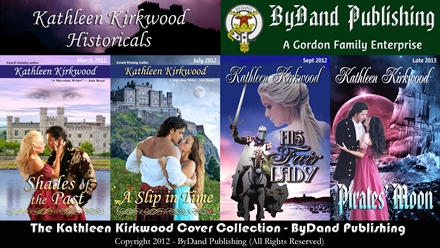
Mr. KK again. As promised in last week’s blog on “Proofing Tools,” this post focuses on development of the cover art for VENECIA’S EARTHLING and some of the new challenges we encountered. Here is the final new cover – in the post, we’ll show you how we built it.


VENECIA’S EARTHLING is the legacy of Anita’s father (my father-in-law), James L. Barbour. It was originally published in 2006 as a print edition only by Trafford Publishing. When we turned it into an e-book and republished it in 2011 in both print and digital formats, we updated the cover fonts and layout, but kept the original artwork. Here are the original and republished covers:

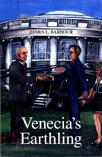
The left image is a scan of the actual printed book cover. The right image is a full digital image of the republished cover. Notice how dark the original cover was (it appears as on the book). I’ve mentioned it before, but it’s worth mentioning again. Print versions (covers, postcards, business cards, etc.) will probably come out substantially darker when printed 10% -to 20% so, plan accordingly. You’ll also notice how the female figure, Venecia, was partially cut out of the picture and that the dachshund is nearly lost in the shadows and behind book’s title. The republished cover allowed us to brighten the original cover, change and relocate fonts, and adjust the image so all figures appear on the page. Details are more visible and even the dog, Felix, can be seen clearly now.

VENECIA’S EARTHLING was our first entry into the e-book world. We’ve certainly learned a lot since then. When we created e-book and print covers for Anita’s revised books, we shared them with her father. Upon seeing the cover art for SHADES OF THE PAST, Dad asked us to re-create his cover with photos instead of artwork. He preferred to keep the visual elements of the original cover as it replicates a specific scene from the book, where Bill and Venecia meet the President on the South Lawn of the White House with the “Magic Slate” technology in hand and Marine One in the background.

There were several challenges in collecting the photo elements from the royalty-free sites, the easiest being the dachshund and the White House.


Our long search for useable figures brought home the importance of key word selections and fine-tuning them. Obviously, business attire is the logical choice for one meeting the President at the White House. Anita began her search with “businessman” and “businessmen.” Noting the tags applied to the photos as they came up, the search expanded to “business coworkers,” “business meeting” and more. Many photos are uploaded by European photographers who might use unexpected tags such as “fashion shot of elegant young man wearing a suit,” instead of simply “businessman.” It’s useful to note down what tags photographers use for their photos. After a LONG search through over a thousand photos, Anita hit upon “businessmen shaking hands” as a tag. She keyed it in and the perfect photo instantly appeared!

A useable photo of Marine One helicopter also challenged us. We discovered that official White House photos are in the public domain, being that they are taxpayer funded and are free to use. While there is a Marine One photo we especially liked on the WH website, it was not of sufficient resolution to be useful. In the end, we used Dreamstime royalty-free site and modified a photo of Marine One in flight.

All these elements were cobbled together into the layout below:


Overall, the cover met with Dad’s approval except for Venecia! Our choice of model did not make the cut. He reminded us that she is described in the book as a “petite, sexy-blonde in a mini-skirt.” Back to the drawing board . . . .

Anita discovered that the term “mini-skirt” brings up many eye-popping photos. Also, most of the women were staring straight at the camera and struck strange “model” poses, with legs and arms thrown wide and hips jutting out. You know the look. After another LONG search, she discovered two promising photos. Unfortunately, neither one was quite right. So, we decided to create “Venecia” out of the two, borrowing a head here, a torso there, editing out body parts, etc. We started with the photos below, one having a useable pose and mini-skirt, the other having the “Marilyn Monroe” beauty that Dad wanted:

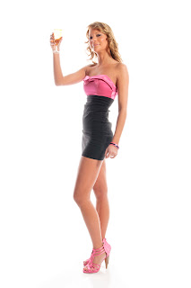
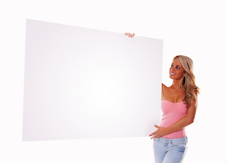
Image #1 (left) was edited, cutting away the model’s head, chest and right arm, but leaving her torso, legs and left arm to use. In image #2, the model’s torso and everything below, including her arm, was edited out. This left her head and chest. Her right shoulder and arm were modified to appear as though it’s lowered at her side, behind her body. The two images were then resized and re-integrated so that the top of the dress in Image #1 overlays the model’s chest in Image #2.

As you can see, there is quite a difference in skin color. The model’s hair is also hidden behind the arm from Image #1. To correct these issues, we added a “suntan” look to Image #1 and reapplied it to Image #2. With the distance between the face, chest and legs broken by the pink and black of the dress the skin tones appear to match.  However, a “seam” remained visible where the chest and left shoulder images joined. The simple solution was to duplicate and lengthen a portion of the model’s hair to overlay the seam line completely and visually separate the chest and arm areas where the “suntan” was close but not an exact match. Finally, we had our new Venecia! In adding her to the cover, she was sized to appear petite and with her line-of-sight fixed on Bill.
A few other elements helped improve the overall design. A slightly shaded transparent banner was added behind the author’s name to help the font stand out more, and to dampen the effect that the people’s feet would appear as though they’re floating above, not standing on the grass. A glowing “magic slate” was added to Bill’s hand with the words “Keys to a New World and Universe.” The title font was changed to Ayita Pro Semi-bold and given a drop shadow, inner bevel and gradient overlay (yellow/orange) so that it “pops” against the whites of the background. The font used for the author’s name, Monotype Corsiva, also used a drop shadow and inner bevel.

After re-integrating all of the elements and adjusting the layout, we came up with the final front cover, which Dad was pleased with. When we created the cover flat for the print book, we re-used the back cover text (originally written by Dad for Trafford) and spruced up the spine with the color title. Below is the final full cover flat. You’ll notice that I left the trim line on this image so you can see where the publisher will cut off the bleed. The version we submitted to Createspace did not have this trim line showing.


As always, if you have any questions, feel free to contact us at Anita’s email address: kathleenkirkwood@aol.com.


By the way, today is Mom and Dad Barbour’s 68th wedding anniversary – July 16, 1944.

HAPPY ANNIVERSARY, Mom and Dad!

Next week’s blog will be on developing Createspace book covers.

Also, look mid-week for a special blog and Highland recipe from Anita, celebrating the release of her Scottish historical, A SLIP IN TIME.

Proofing Tools

USING THE PUBLISHERS' PROOFING TOOLS

Hi, Mr. KK here again. This week’s post is on using the available Amazon and Barnes and Noble proofing tools to check the uploading, conversion, and final format of your book.


The second edition of VENECIA’S EARTHLING was the first e-book we published. Our son Scott re-did the cover (except the art) for the new version and Anita and I formatted the interior (the content). We started out with a Smashwords version. The only proofing tools available at that time (after putting the book through the “Meat Grinder”) were the readers for the various formats. We used Adobe Digital Edition to look at the PDF version. We couldn’t check the other versions because we didn’t have readers for them. We next did the Nook and Kindle versions and thank goodness at least there were monochrome PC readers for both of them.

Fast forward to today. The Kindle Fire and the Color Nook are both out and there are now color PC readers for them. In this post, we’ll discuss the use of the current release of proofing tools for Amazon and Barnes and Noble. We are not currently publishing with Smashwords, so we won’t discuss them again in this post.

If you’re not going to do print books, you won’t need to know about the Createspace tools. But, we think they’re a cut above the rest of the tools. So, if you’re even slightly considering a print version, you’re going to love the Createspace Digital Proofing Tool (which we’ll discuss later).

If you haven’t discovered it yet, you should know that Kindle, Pubit and Createspace format their books differently. Some allow super and sub scripts and footnotes. Some can have page and section breaks. Some can use the Microsoft Word Table of Contents creator. Etc, etc. After you’ve finished formatting your book for the publisher you choose (make sure you use their Style Guide and templates to get the formatting right), you should check to see what their publishing tools did to your book after upload and conversion. Here’s how you do it with each.

AMAZON KINDLE 

You create and format your e-book in a word processing program (Microsoft Word is the most popular). When you’re ready to produce a Kindle-compatible version of your masterpiece, you’ll save the file in html filtered format (one of the format choices in the “Save As” pop-up window in MS Word). Then you use the Mobi Pocket Creator to create your prc file. You import the html file you saved in MS Word, add the cover image and table of contents and then click on the Build button. The Pocket Creator then generates a PRC file for you to upload to Amazon Kindle Direct Publishing (KDP). The online tool converts the book to MOBI format and offers you the opportunity to preview it on line with the Simple Previewer or on your desktop with the Enhanced Previewer. The Simple Previewer is really simple and appears to display only monochrome. The Enhanced Previewer can be set for any of the Kindle reader products. Here’s what the Kindle Fire Previewer looks like running on your PC (shown with Anita’s SHADES OF THE PAST book loaded)


You can also preview your Kindle e-book with the Kindle for PC application, which I prefer. Here’s a screen capture of it, with VENECIA’S EARTHLING loaded.


These tools give you a really good idea of what your book will look like on a Kindle e-reader. Note that they allow you to see the cover.

BARNES AND NOBLE NOOK

The PubIT tools are easier to use to get your book uploaded and converted. For example, they will take the Microsoft Word format directly and convert it to e-Pub format for the Nook. But, I personally don’t think the previewing tools are as good. Below is a screen capture of the Nook Color Previewer. I haven’t been able to figure out how to get it to show you the cover. And, it forces you to go page by page through your book (I haven’t found a “go-to page” function yet).


You can also preview your Nook e-book with the Nook For PC application, which works well. I haven’t been able to get it to show me the cover either.


AMAZON CREATESPACE

The Createspace process allows you create and upload your book in Microsoft Word compatible formats (.doc and .docx files). However, your cover must be uploaded in a “print-ready” PDF format, so you’ll need a PDF writer program (such as Adobe Acrobat) to do this. The uploading tools take care of converting the book and then you can submit it for a formatting review. Once Createspace approves your book for publishing, you’re offered  the opportunity to order a physical proof copy for a very reasonable price, delivered in a few days or to proof your book in their Digital Proofing Tool. If this is the first time you’ve worked with Createspace, a physical proof is recommended. As I mentioned in an earlier post, we got a few surprises when SHADES OF THE PAST came back for proofing (the cover came out MUCH darker than the onscreen image and the spine crept). If you’ve been through a physical proofing process and know that the brightness, contrast and cover placement are okay, then the Digital Proofing Tool is recommended. Here’s a screen capture of the Digital Proofing Tool with VENECIA’S EARTHLING loaded.


Note that it first shows you the cover and how it fits the book size you’ve chosen. Also, note that you can look at any part of the book two pages at a time by moving the slider on the right. It shows you the placement of the text on the left and right facing pages, along with the gutter in between. We had one version of one of the books (I forget which now) where we had an extra blank page in the forward portion of the book. This threw off our left and right pages. They came out backwards. Not only did the conversion tool catch this problem and give us error messages, but when we looked at the book in the Digital Proofing Tool, it was obvious what had happened and we were able to fix the problem right then in real time.

A good rule of thumb is that you should at least spot check the book in various places to make sure the formatting comes out the way you expected. Going through all the way is a good idea the first time you use the tool.

We hope that this brief look at the proofing tools has been helpful. E-mail us at Anita’s e-mail address if you have any questions: kathleenkirkwood@aol.com

The next post will discuss cover development for VENECIA’S EARTHLING and the use of body parts and stitching together images.

A Slip In Time - Cover Flat

THE COVER FLAT FOR A SLIP IN TIME

Mr. KK here again. The last post concluded our series in Cover Art Development for the SHADES OF THE PAST cover. In this post we’ll discuss our latest project – the cover for A SLIP IN TIME and some of the challenges we encountered developing it. For all of you who have been waiting for the newly revised edition of A SLIP IN TIME, it will be released this week in e-book formats and next week in print format.

First, Anita and I would both like to thank all of you who gave us your inputs on the selection of the three candidate front cover designs and then the castle selection on the “blue” cover design. Here is the final cover flat for A SLIP IN TIME.


There were several challenges associated with the development of the cover designs – the backgrounds, the couple and the castle.

First, let’s discuss the backgrounds. Here are the original castle photos that we adjusted to become the backgrounds for each of the candidate designs.


Each castle photo required editing to size it for the covers. The book size Anita chose was 5.25” x 8.0”. When you add the 1/8” bleed all around, the submission size for the front cover is 5.5” x 8.25”. At 300 dots per inch, this means that the backgrounds must be 1650x2475 pixels.

The “red” castle (Eilean Donan Castle) was cropped and placed within the cover frame to give it the look Anita wanted. The “gold” castle (Scaligers Castle) was not large enough to fill the cover frame, so I had to actually use the bottom part of the image three times over (in layers) to get the height we needed to fill the frame. The “blue” castle (Edinburgh Castle) was used at full size and we added a blue filter to it to get a darker, more foreboding “night” look for it. We also added a hillside from another photo in the foreground to give the image some color (green grass with red and yellow flowers. A moon was added to all of the backgrounds because it’s a key element in the “time slips.” Here are the “adjusted” background images for each design.


The couple proved to be somewhat of a challenge also. Anita selected a Jimmy Thomas photo to represent her hero and heroine. I removed the background, using Photoshop’s Quick Selection tool. Being that her hero is a 15th century Scotsman, he needed to be wearing a kilt. Anita found a second Jimmy Thomas photo of him in a kilt. She was particularly pleased that it was a red kilt, which is correct for the hero’s clan affiliation. I edited out the kilt, slimmed it down a little and placed it over the hero’s black pants. The bottom part of his shirt also had to be cut out and placed over the top of the kilt to make it look like the shirt was not tucked in.


We added a decorative banner to the red and gold covers and kept the same look as SHADES OF THE PAST on the blue cover. We tried various fonts and color gradients for the title and author’s name and settled on those shown below:


As she mentioned in an earlier post, Anita was bothered by the plain facade of Edinburgh castle, which didn’t fit the story’s description of Dunraven Castle. So, we went on a search for replacement castles. After MANY trials, we chose Culzean Castle. Here are the original image of the castle and the “adjusted” image, after we deleted the sky and most of the foliage, and reversed the image. We also enlarged the end tower and blackened the windows, which in medieval times would have been “unglazed” (without glass) and shuttered on the inside.


For the cover flat, we used a variation of the SHADES OF THE PAST layout, with a twist. On the original 1998 cover flat, the publisher had used a slice of the front cover background as part of the back cover background and a solid color for the spine and approximately two-thirds of the back cover, placing the text over it. We tried it and liked it, so we kept it. You may notice we moved the moon, too (on the back cover). Here’s that final cover flat again:


As always, if you have any cover art questions, feel free to contact us at Anita’s e-mail address: kathleenkirkwood@aol.com.

Next week’s cover art post will be on the use of the Amazon and Barnes and Noble proofing tools to make sure the cover and interior uploaded, converted and formatted properly.

Shades of the Past Cover Art - Part 6

CREATING THE COVER FLAT


This is the last post on the development of the SHADES OF THE PAST cover and it discusses the creation of the back cover, the spine and the integration of all of the elements into the cover flat (the printed art cardboard cover that gets wrapped around the book).

I used Adobe Photoshop to create the back cover and Serif DrawPlus to create the spine and integrate everything into the cover flat (when we created the A SLIP IN TIME cover, I shifted over to Adobe InDesign to integrate the elements for the cover flat – I’ll talk about that in a future post). Please keep in mind that, when you’re working with a print version, the final cover needs to be at 300 dots per inch resolution. And, it needs to be submitted to Createspace in PDF print-ready format. This results in a 20MB (approximately) cover flat to be uploaded to Createspace.

As usual, Anita had an idea of what she was looking for on the back cover (which was based on the Lords of Midnight cover version). She wanted a banner with the book title across the top, a cameo of the couple, the full Julie Beard quote and the write-up she developed for her website. We decided to use a pale blue background for the back cover, with a dark blue spine separating the front and back covers. The pale blue color was chosen to match the shade of blue of the water on the front cover (as closely as we could get it). The dark blue for the spine and back banners was the same color we used for the banner on the front cover.

The back cover banner was created the same way as the front cover banner (as discussed in my earlier post on text and banners for the front cover). The back cover banner text is unenhanced, pure white Monotype Corsiva. The remainder of the back cover text is in 11.5 point Times New Roman, also unenhanced except for bold and italics as needed for emphasis. This point size was chosen so there would be enough room left at the bottom of the cover for the UPC label, which Createspace would insert.

The cameo – now that was quite a bit of work to produce. We took the third Jimmy Thomas photo that appeared in my last post and removed the background (as we did for the front cover “couple” photo). We then found a circular frame in the Dover collection, removed its background and added a color gradient to it. Lastly, we took a piece of the sky from the front cover background to use as the background for the cameo. By placing the sky layer in the background, the couple layer over that, and ring layer on top, we came up with the cameo.

For the spine, we were inspired by the original Lords of Midnight cover. We knew we wanted an imprint at the top, the author name next, a smaller cameo, then the book title. We chose a feather pen with flourish for the imprint, removed the background and reversed the image colors. We created a small cameo using a part of the front cover (the couple) in an oval cutout. And we used unenhanced Monotype Corsiva for the author name and title. For your information, the spine width depends upon the page count. There’s a formula to calculate it. Once you know the width you need, based on the page count, you can allocate the right amount of space for the spine. Here’s the resulting cover flat (without the bleed):


So, we submitted the cover and interior. We went through the review process and ordered a proof copy of the book. It came rather quickly, but it had some surprises for us. As I mentioned in the last post, the proof came out with a MUCH darker cover. We also discovered later that, when we ordered multiple books at the same time, the cover placement appeared to drift, such that spine placement varied somewhat. So, I lightened up the front cover and widened the spine, taking away width from the front and back covers. This resulted in a narrow dark blue stripe down the right side of the back cover and one down the left side of the front cover, which Anita found acceptable. Here’s the final cover flat (with the bleed, an additional 1/8” around all sides):


This post concludes the “Adventures in Cover Art” blog series for the SHADES OF THE PAST cover. I have a few more experiences to share in the development of the VENECIA’S EARTHLING, A SLIP IN TIME and HIS FAIR LADY covers. There will probably be one or two posts on each, dealing with the particular challenges encountered on each cover, not a longer complete series on all of the aspects as we’ve done for the SHADES OF THE PAST cover development. E-mail Anita if you have any questions on cover development. Her e-mail address is: kathleenkirkwood@aol.com.

Late addition: the next cover art post will be on Castles, kilts and moonlit nights - A SLIP IN TIME, which will be released next week. Please check back on Monday, July 2nd.