
THE COVER FLAT FOR A SLIP IN TIME
Mr. KK here again. The last post concluded our series in Cover Art Development for the SHADES OF THE PAST cover. In this post we’ll discuss our latest project – the cover for A SLIP IN TIME and some of the challenges we encountered developing it. For all of you who have been waiting for the newly revised edition of A SLIP IN TIME, it will be released this week in e-book formats and next week in print format.
First, Anita and I would both like to thank all of you who gave us your inputs on the selection of the three candidate front cover designs and then the castle selection on the “blue” cover design. Here is the final cover flat for A SLIP IN TIME.

There were several challenges associated with the development of the cover designs – the backgrounds, the couple and the castle.
First, let’s discuss the backgrounds. Here are the original castle photos that we adjusted to become the backgrounds for each of the candidate designs.


Each castle photo required editing to size it for the covers. The book size Anita chose was 5.25” x 8.0”. When you add the 1/8” bleed all around, the submission size for the front cover is 5.5” x 8.25”. At 300 dots per inch, this means that the backgrounds must be 1650x2475 pixels.
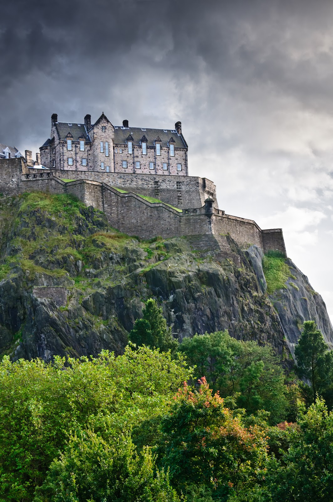
The “red” castle (Eilean Donan Castle) was cropped and placed within the cover frame to give it the look Anita wanted. The “gold” castle (Scaligers Castle) was not large enough to fill the cover frame, so I had to actually use the bottom part of the image three times over (in layers) to get the height we needed to fill the frame. The “blue” castle (Edinburgh Castle) was used at full size and we added a blue filter to it to get a darker, more foreboding “night” look for it. We also added a hillside from another photo in the foreground to give the image some color (green grass with red and yellow flowers. A moon was added to all of the backgrounds because it’s a key element in the “time slips.” Here are the “adjusted” background images for each design.


The couple proved to be somewhat of a challenge also. Anita selected a Jimmy Thomas photo to represent her hero and heroine. I removed the background, using Photoshop’s Quick Selection tool. Being that her hero is a 15th century Scotsman, he needed to be wearing a kilt. Anita found a second Jimmy Thomas photo of him in a kilt. She was particularly pleased that it was a red kilt, which is correct for the hero’s clan affiliation. I edited out the kilt, slimmed it down a little and placed it over the hero’s black pants. The bottom part of his shirt also had to be cut out and placed over the top of the kilt to make it look like the shirt was not tucked in.


We added a decorative banner to the red and gold covers and kept the same look as SHADES OF THE PAST on the blue cover. We tried various fonts and color gradients for the title and author’s name and settled on those shown below:


As she mentioned in an earlier post, Anita was bothered by the plain facade of Edinburgh castle, which didn’t fit the story’s description of Dunraven Castle. So, we went on a search for replacement castles. After MANY trials, we chose Culzean Castle. Here are the original image of the castle and the “adjusted” image, after we deleted the sky and most of the foliage, and reversed the image. We also enlarged the end tower and blackened the windows, which in medieval times would have been “unglazed” (without glass) and shuttered on the inside.

For the cover flat, we used a variation of the SHADES OF THE PAST layout, with a twist. On the original 1998 cover flat, the publisher had used a slice of the front cover background as part of the back cover background and a solid color for the spine and approximately two-thirds of the back cover, placing the text over it. We tried it and liked it, so we kept it. You may notice we moved the moon, too (on the back cover). Here’s that final cover flat again:

As always, if you have any cover art questions, feel free to contact us at Anita’s e-mail address: kathleenkirkwood@aol.com.
Next week’s cover art post will be on the use of the Amazon and Barnes and Noble proofing tools to make sure the cover and interior uploaded, converted and formatted properly.
No comments:
Post a Comment